%20copy.png)

Studio Gilyn
2020, Beauty
DISCIPLINE Logo Development, Brand Identity, Branding Materials
Studio Gilyn is a luxurious nail salon that provides contemporary and illustrative nail art based in North Jakarta. The word Gilyn is derived from the founder’s daughter which is engrained to the brand story itself.
The Objective
Create an end-to-end brand identity from logo development to visual identity to branding materials such as social media template and nail card.
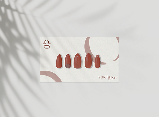
The Solution
We focused on creating a simple yet memorable and bold logo for Studio Gilyn. The connection between mother and daughter is depicted in the logo through the intertwining of the two words. The secondary logo is a stylized libra icon fused with the G from Gilyn, representing the daughter and her star sign. This symbol is then further stylized to become one of the visual identity so that there is unity in the overall branding. The red carmine color is meant to be the main color of Studio Gilyn; an adventurous and daring color, encompassing the brand as a whole. The overall logo & look and feel is well-groomed, clean, and modern, consistent with Studio Gilyn’s brand personality.